Arty Party 2 Paintings

This series Brushes are 12 acrylic paintings inspired by Arty Party 2 where the theme is :  This is how I work.

The paintings are a comment on my new medium (acrylics) which is messy. I am poking at painting as a joke and saying that it’s not that serious. How am I doing this? I don’t have perfect brush strokes so the painting looks rushed. Why am I doing this? Because I am new at painting and I want to enjoy it not kill my interest with laboriously executed perfect brush strokes nor infect my efforts with weak ideas.

I have chosen four words to use on some of the paintings to explain my university studio routine, namely Arrive, Work, Fun, Love It. The words are not perfectly spelt so there is some working out for the viewer to do. I am also trying to highlight my own technical imperfections in the paintings. The viewer may notice and say what is going on here. The studio concept is the point in this series, not technicalities.


Here is the series called Brushes 1-12 that I painted:

20191112_114054
Artist Ruth Newell, Brushes 1, October 2019, 20 x 22.5cm, acrylics on board (2 Analogous colours : green and blue outlines on white background)
20191112_114034
Artist Ruth Newell, Brushes 2, October 2019, 20 x 22.5cm, acrylics on board (Yellow outline and white on black background)
20191112_114059
Artist Ruth Newell, Brushes 3, October 2019, 20 x 22.5 cm, acrylics on board (Cool colours : greens and purple on blue background)
20191112_114049
Artist Ruth Newell, Brushes 4, October 2019, 20 x 22.5 cm, acrylics on board (Cool colours : green, blue, purple on black background)
20191112_114147
Artist Ruth Newell, Brushes 5, October 2019, 20 x 22.5 cm, acrylics on board (Warm colours : orange and red on yellow background)
20191112_114040
Artist Ruth Newell, Brushes 6, October 2019, 20 x 22.5 cm, acrylics on board (Warm colours : yellow and orange on red background)
20191112_114045
Artist Ruth Newell, Brushes 7, October 2019, 20 x 22.5 cm, acrylics on board (Warm colours : red, orange, yellow on white background)
20191112_114125
Artist Ruth Newell, Brushes 8, October 2019, 20 x 22.5 cm, acrylics on board (Complimentary colours : purples on yellow background)
20191112_114118
Artist Ruth Newell, Brushes 9, October 2019, 20 x 22.5 cm, acrylics on board (Complimentary colours : greens on red background )
20191112_114108
Artist Ruth Newell, Brushes 10, October 2019, 20 x 22.5 cm, acrylics on board (Complimentary colours : orange and yellow on blue background)
20191112_114140
Artist Ruth Newell, Brushes 11, October 2019, 20 x 22.5 cm, acrylics on board (Analogous colours : yellow and greens on blue background)
20191112_114134
Artist Ruth Newell, Brushes 12, October 2019, 20 x 22.5 cm, acrylics on board (Analogous colours : purples and blue on red background)

I enjoyed doing these paintings. I actually like them. They explain my new studio medium : painting. I want to explore colour combinations some more to see what colours dominate and  when. It’s fun.

Arty Party 2 :Process

In response to Arty Party 2 theme: this is how I work I wanted to show off my paintbrushes in my studio because painting was all new to me and I was excited about it. This is how I created the series of 12 paintings, Brushes.

I took 12 photos on my phone of the paintbrushes on my studio table in different positions. It began as effortlessly as that. I printed all the photos out:

I cut 12 pieces of wood the same size in the wood department.  I gesso painted them. I drew the different paintbrush photos on them.

I started to think about colours.  I wanted to mess around with combinations : primary colours, complimentary colours, analogous  colours cool colours, warm colours, black and white. I drew out a colour plan for each board:

1589040796330511544891

I wanted to include 4 words in the paintings that explained my studio routine when I painted: arrive, work, fun, love it. I left some letters out to make them more interesting. I made stencils for them:

1589041031450987209630

I painted the 12 boards according to plan and really enjoyed the process and the outcomes:

Arty Party 2 : Artists (visit to London)

I went to the The National Gallery in London. It would take 8 hours to look at every art piece there.  I was there for 4 hours.  An artist friend gave us a tour. Five things came of it:

1. I was very struck by the dyptichs and tryptichs. I got flashbacks of the tryptichs I did after my Morocco trip in 2nd year. I want to work on these again but inspired by the ones I have seen here.  I took photos of a few art pieces that struck me this time.

2. I want to come again and do 2 things: photo every painting that has an awesome way of inserting artists signature and every painting that has a shoe I like.

3. Then I will experiment with how I want to sign my paintings.

4. Also, create a painting with all the shoes I like from the National Gallery in London so I can keep looking at them. Might be sellable work in this. This would be a cataloguing/archival painting.

5. I went to the shop. Saw all the art on things for sale. I want to do research and put my art on classy reliable things for Christmas fairs. Need time to think through what I would want to use.

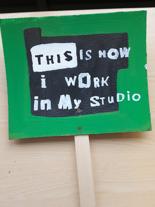
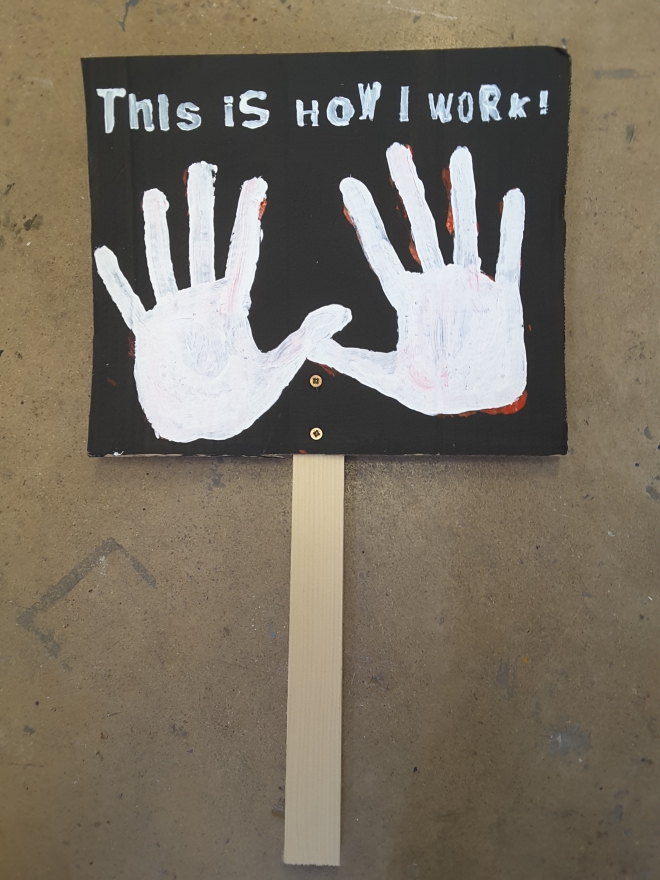
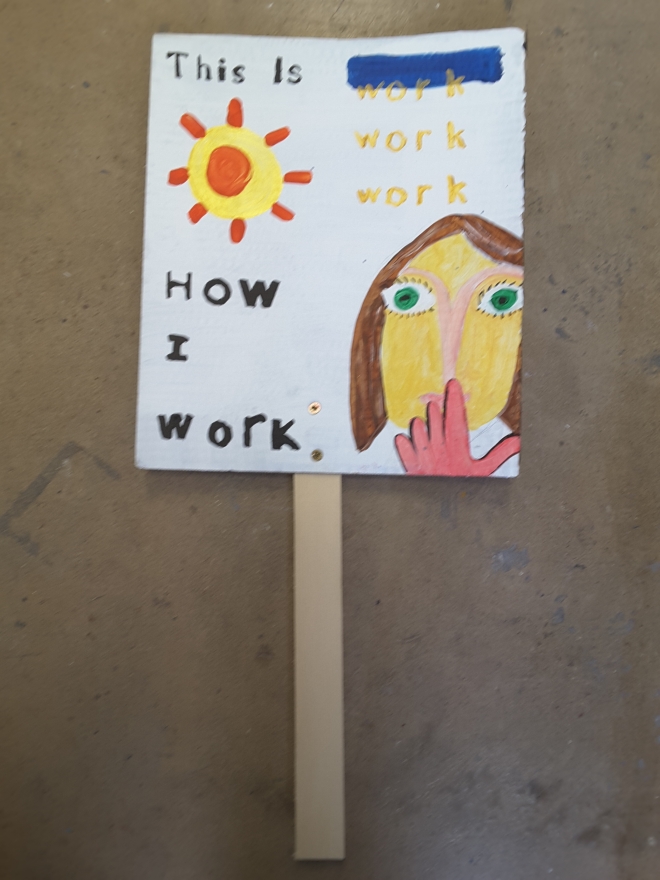
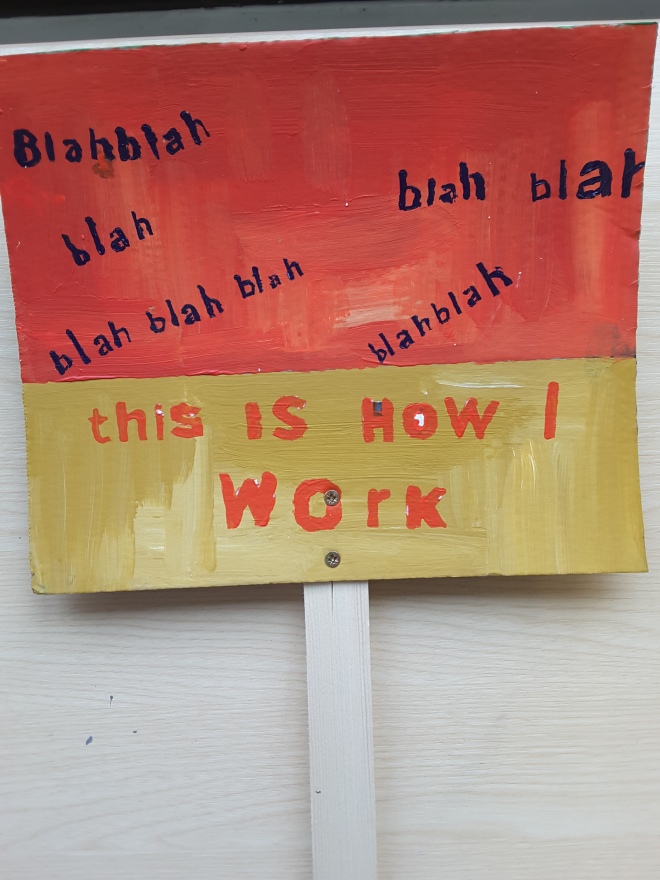
I walked through Trafalgar Square where Extinction Rebellion campaigners were camping. There were police everywhere. It was exciting. The Welsh campaigners travelled back on the bus with us. They were ordinary people with a passion. The best banner was: TRUTH DEMANDS ACTION. Also, a poem and their logo: an hourglass in a circle to say time runs out in 2050. I saw placards in a real campaign. I thought about mine in the studio. It was an experience!

I went to the Portrait Gallery. It has portraits of important and famous people.  For me the best was an LCD screen portrait (a thin flat panel that electronically displayed the portrait). It randomly changed psychedelic colours. It was really good. It was Dame Zaha Hadid by Michael Craig-Martin (2008).  She is a 65 year old Iraqi architect who was made Dame by Elizabeth II for her services to architecture. Her quote is:  there are 360 degrees so why stick to one!? I also went through the BP portrait award 2019. I didn’t like them.

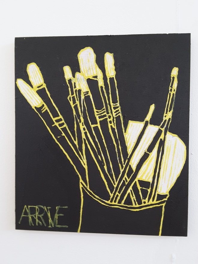
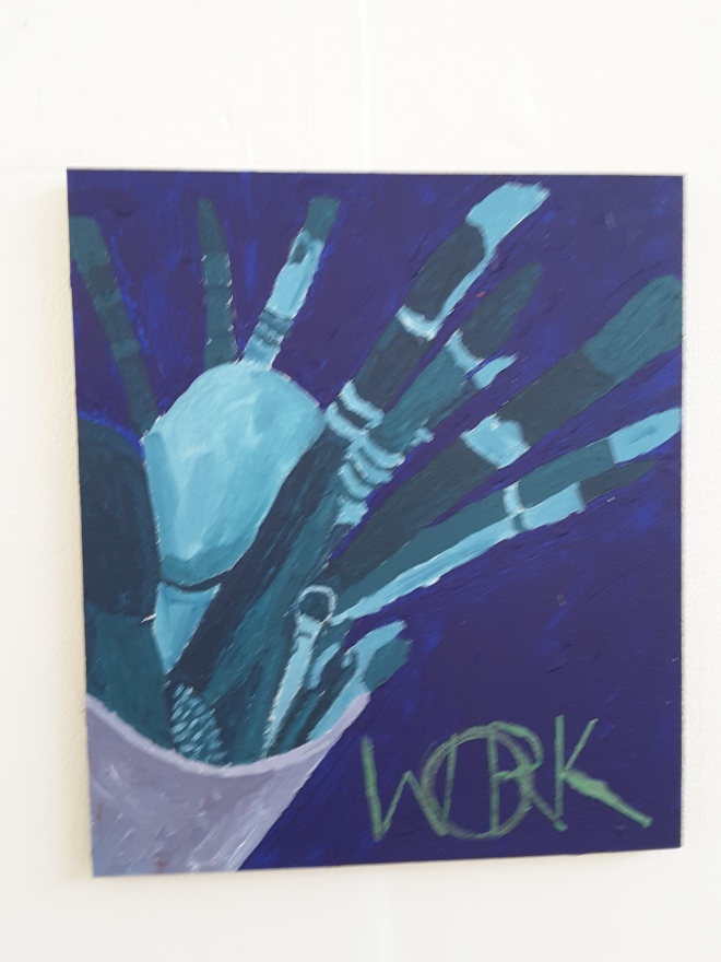
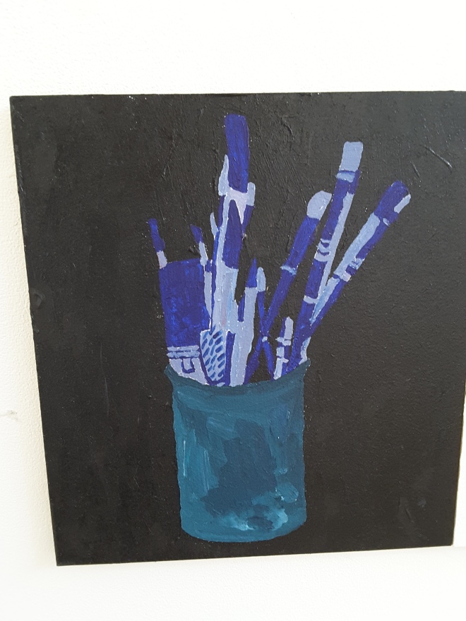
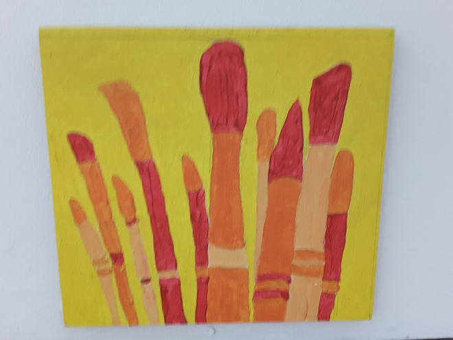
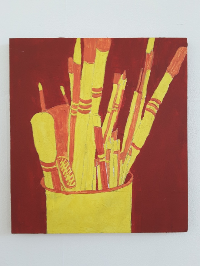
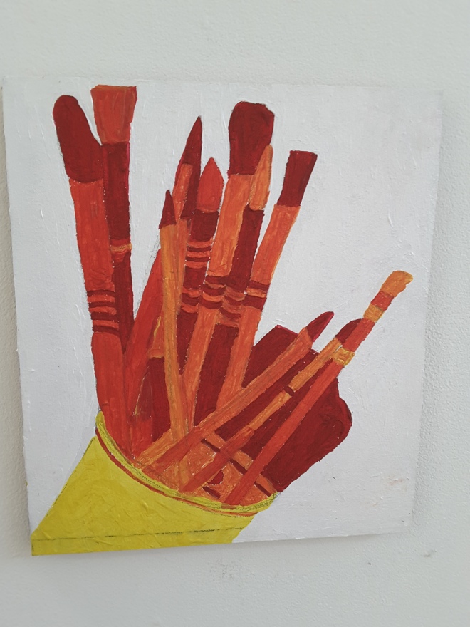
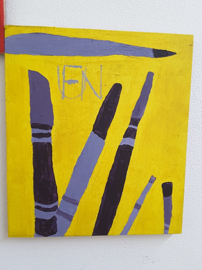
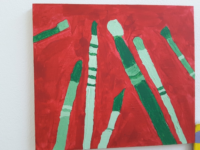
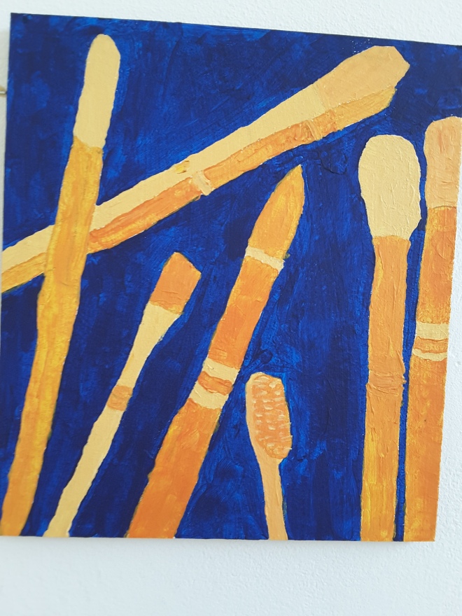
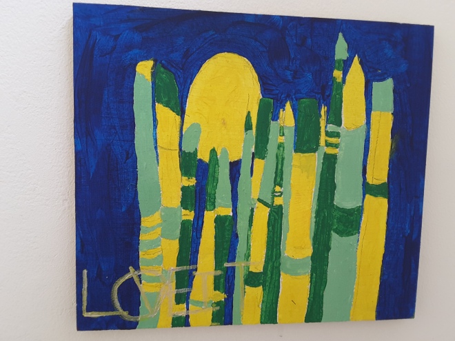
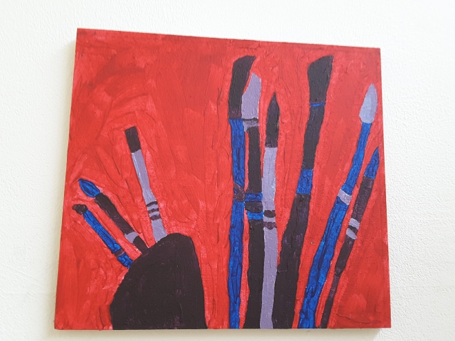
Some of his other pieces online have inspired me to do pop art colours and black outlines with my paintbrush photos (from arty party 2) in acrylic paintings on board.

The next day I went to the Tate Britain. I was bowled over when face to face with Turners 1805 oil: The Shipwreck, and Constable’s 1803 painting: Salisbury Cathedral from the Meadows, and Hockneys 1964 Man in Shower in Beverley Hills….. All three huge but also impressive.

I got ideas and I was inspired by 9 smaller pieces I saw there:

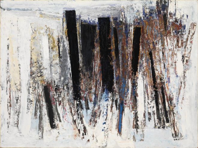
Keith Vaughan Jumping figure 1987 oil on canvas. Light colour in dark space, abstract shape for my studio space photos

Ivon Hitchens Autumn Composition 1932. Mixed media painting idea for poem to collage to mask to painting.

Autumn Composition, Flowers on a Table 1932 by Ivon Hitchens 1893-1979

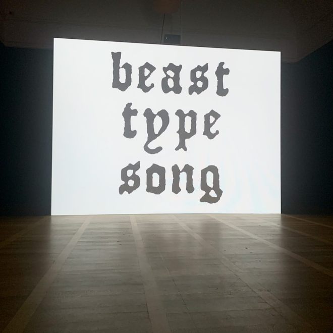
Sophia Al Maria Beast Type Song 2019 video. Colour. Sound 38 minutes.                  Nice abstract 38 minute video idea for my final piece: colour sound script movement empty echo desolate space base on studio book about experience talk movement in my space

70239061_837407563323584_6926910936193100726_n

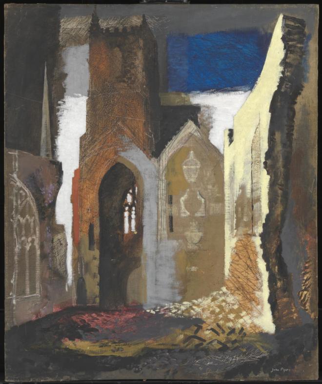
John Piper St Mary Le Port Bristol oil graphite. Use colour and shape to create studio space painting. Make it interesting like this with table chair walls light opening (window) and colour. How to make boring building painting interesting.

St Mary le Port, Bristol 1940 by John Piper 1903-1992

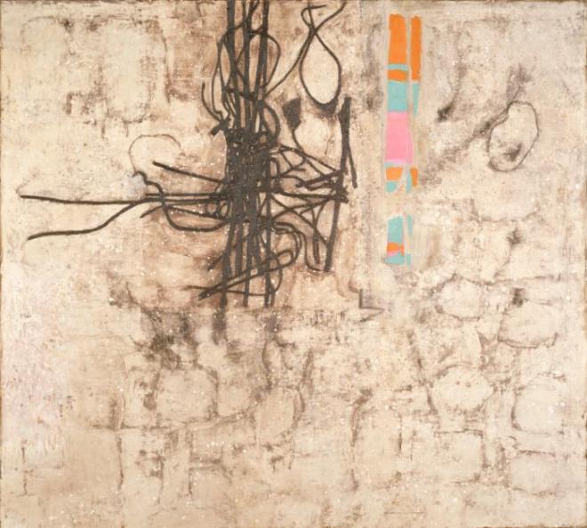
Prunella Clough Wire and Demolition 1982 oil.canvas.   liked the wire sqiggle.

Wire and Demolition 1982 by Prunella Clough 1919-1999

Paul Feiler Morvah 1958 oil on board.  Impression of landscape.

6407224246a8f8aa2dab39dd00dfda3b

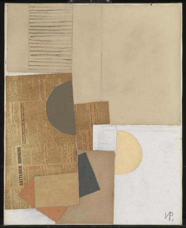
Victor Pasmore Abstract in white grey ochre 1949 graphite paper.  More mixed media idea for mixed media paintjng for poems.

Abstract in White, Grey and Ochre 1949 by Victor Pasmore 1908-1998

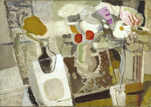
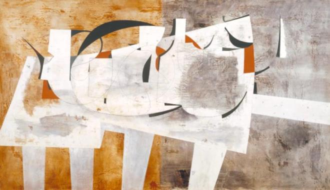
Ben Nicholson August 1956 oil gesso graphite board. I like the tables against 2 colours.

August 1956 (Val d'Orcia) 1956 by Ben Nicholson OM 1894-1982

Ben Nicholson Auberge Le La Sule 1932.  Always wanting to do series of open window paintings. Here is another one. Research and collect them to get ideas and do mine from my studio space.

Arty Party 2 Talk

20200505_083322
Arty Party 2 Talk    Writer Ruth Newell    10 October 2019

This is a Talk  I wrote for Arty Party 2 about how I work in my art practice, and where my studio comes into that. This talk was inspired by various ideas I read in 21 pages of The Studio book (edited by Jens Hoffman). I found the process of writing this talk a helpful exercise in working through my own practice and hope that by sharing it in arty party 2 others will connect with the topic and discuss their own practices. Who knows what might come out of this : a collaboration?!

20200505_08334720200505_083402


I also referred to these artists in my talk:

20191010_11460620191010_114615

Robert Smithson:

20191010_114629


Arty Party 2 feedback!

Feedback was positive. Making my talk informal, interactive with discussion starters and openings allowed people to participate. Next time will try origami invites to get numbers up again who attend. Also, may do a group photo for placards to make a change from the placard walk. I want to put up  a term schedule of arty party but it would be too much pressure for me to keep to that. I am videoing my talk and placard participation on my own next time!

1571746811031116785444615717468713922051237383157174684159076103507415717468941681146725315

Arty Party 2 Placards

I created the 7 cardboard placards below using acrylics, and stencils made from magazine and newspaper text cut-outs. These are initial boosters to get me on course with the Arty Party 2 theme: this is how I work. I wanted to make a beginning of any kind in exploring this new topic. I don’t consider them works of art. The placards for me, are just an initial step in a new path.  Yay! I can’t wait to get going now.


20200413_093027
Arty Party 2 Placards    Artist Ruth Newell    14 October 2019    acrylic on cardboard           25 x 31 cm

I screwed wooden slats onto each of the 7 cardboard placards so they can be held on a studio walk in the Arty Party. This action is an attempt to get the people who come to my Arty Party 2 in tune with the theme (either before or after the talk to prepare or consolidate it). By choosing the placard they want to hold, and by being videoed as they participate in this studio cat walk the topic they are holding may provoke a verbal response during or after the talk. I hope so. Awesome.

20191010_11504520191010_11505820191010_11521320191010_11512120191010_11510920191010_11522420191010_115235

Arty Party 2 invites

20191010_11451820191010_114545
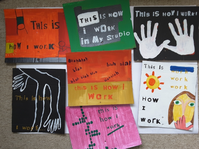
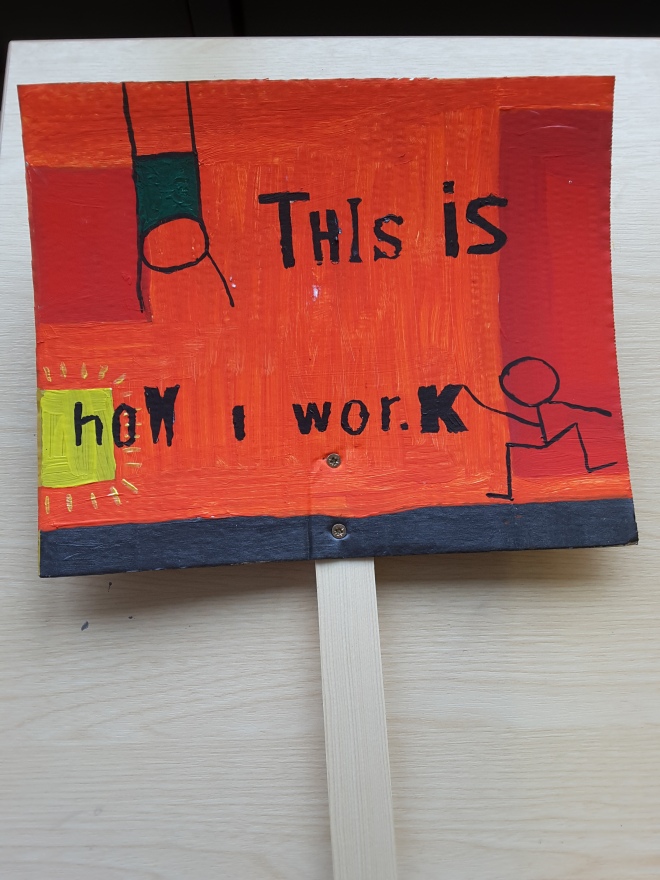
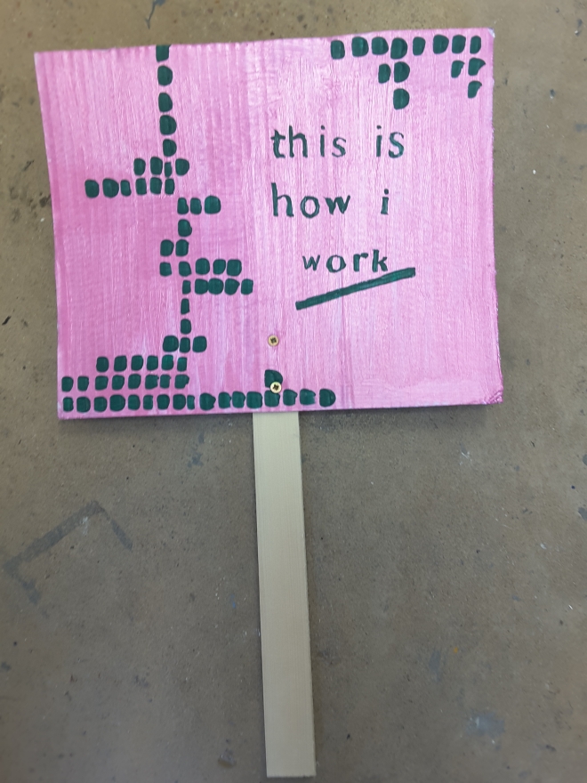
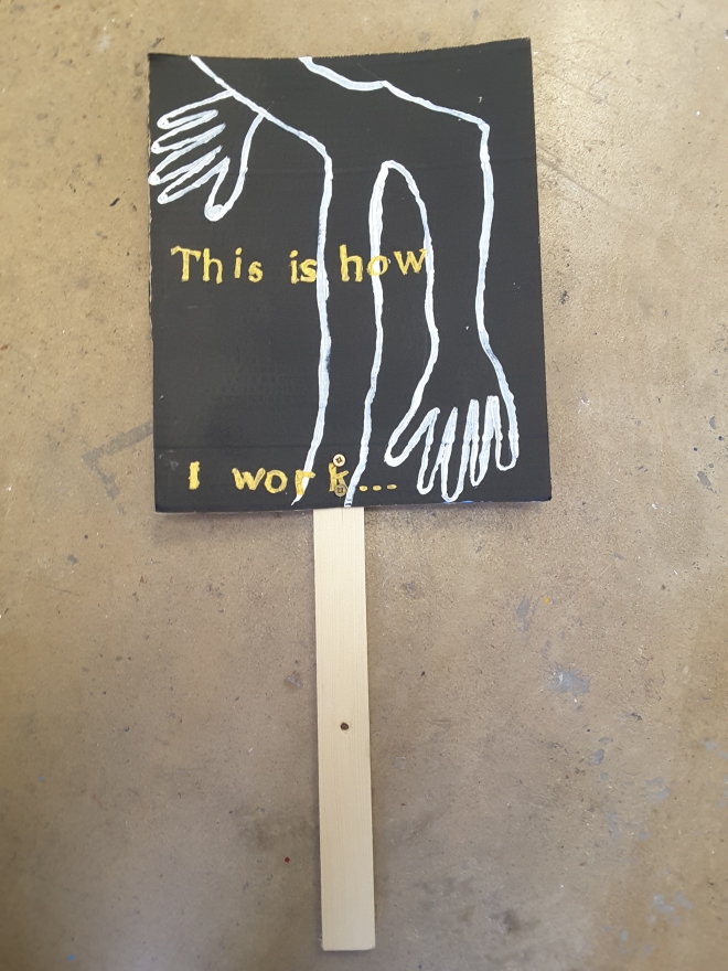
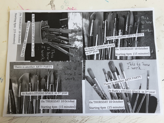
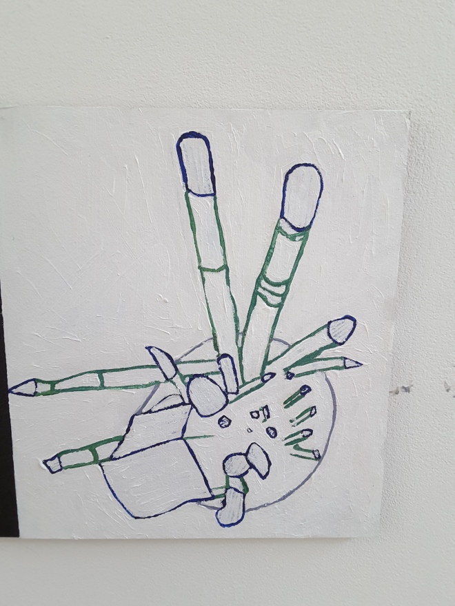
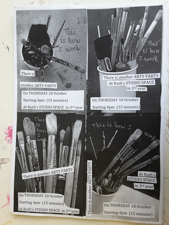
I took some photos of my paint brushes in my studio space.  I glued some details on them. I printed them out on coloured paper. I invited all 3rd years by putting an invite on each desk. I didnt invite 1st and 2nd years this time.

I liked the photos and that it was a personal touch from my studio space to theirs. I felt the coloured paper was more effective than the white paper I used last time and still cheaper than colour printing. I still felt there was not enough punch in the invite. Origami next time!?

Getting organized….

I found it helpful to work out what this year is going to involve:

20190926_154442

I sticker-marked all the days I have an Arty Party in 3rd year, on a planner calendar:

20190922_194956

I made a vision board to time-manage everything:

20190922_194743

Below are the different areas I detailed in the vision board. This is what I want to work on in 3rd year:

I am looking forward to getting stuck in!

Tutorial with Paul Granyon

Today I showed Paul my arty party schedule, feedback comments, talk print out, stencils, placards, invites, studio space. We had a chat about what I have done and am doing this year. He said it seemed pretty solid.

He suggested I dont start editing my vidoes until the end of the year. He said I may not be able to sustain the level of work and enthusiasm I currently have. It may fluctuate over the year. He said I should be flexible about my schedule. It may change direction. I should have an open mind. He said I could look into archiving and displaying my studio work for finals. He suggested two books from the library in this respect: Art and Text (different ways to present text in art); Day-to-day Data.

I asked him about my idea for a pile of soil on studio desk for a gap crit. I told him I didn’t feel confident about Gap Crit. He said it would be fine as it would provoke discussion and that is what they want. Still scared.